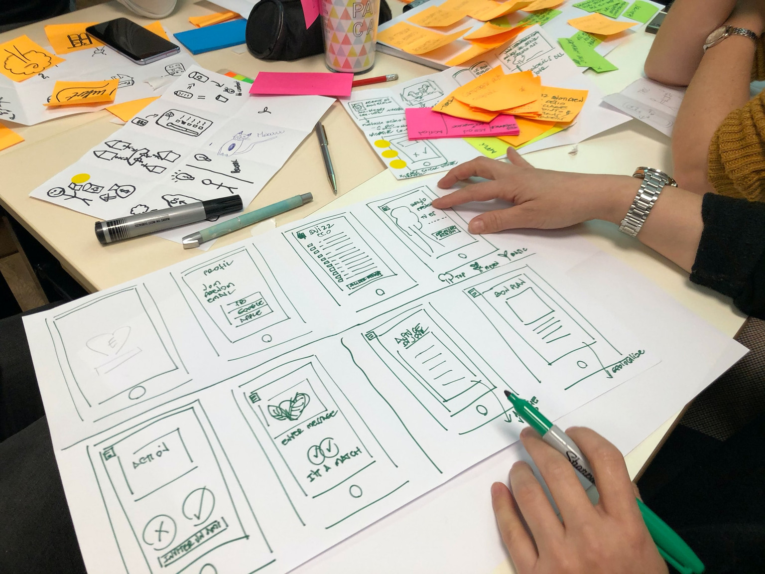
- The history of storyboarding
- Why you should storyboard your next UX design
- How to storyboard for UX design
Storyboarding in UX design can help you make incredible products that solve pain points.
UX designers use a wealth of UX research methods, like interviews or workshops, to improve user experience. They condense the most important research findings into user stories and show these to their design team with wireframes or user personas. Boords' Commenting & Feedback feature could be used to gather and manage feedback from these interviews or workshops, making the UX research process more efficient.
Throughout this work, it's crucial that UX designers remember that they're designing for real people, not just user personas. They need to have a deep understanding of customers' pain points and how their products can help. And that's where UX storyboards come in.
Whether you work in user research or elsewhere in the design team, this post will show you how to use UX storyboards to power your UX design process and take your customer experience to heady new heights.
Create a storyboard for your UX design in Boords.
One tool for storyboards, animatics, and client sign-off. No missed feedback, no expensive reshoots.

The history of storyboarding
A storyboard's a series of drawings accompanied by a little bit of text, where each drawing represents a specific part of the story. It became popular in the motion picture production world back in the 1930s thanks to a guy called Webb Smith.
Get your FREE Filmmaking Storyboard Template Bundle
Plan your film with 10 professionally designed storyboard templates as ready-to-use PDFs.
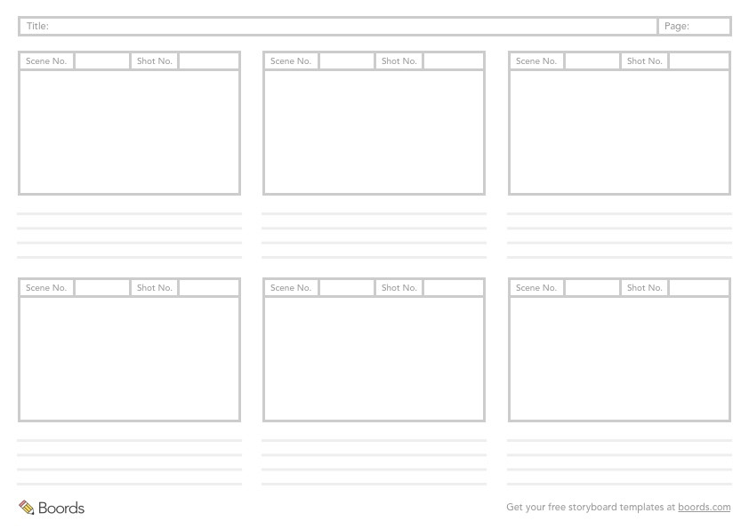
Smith, an animator at Walt Disney Studios, started drawing rough sketches of frames on different bits of paper, then stuck them up on a wall to communicate a sequence of events. Since then, plenty of people have adopted this approach in different industries – including Jake Knapp, a design bigwig who pioneered the Design Sprint at Google.
Why you should storyboard your next UX design
A storyboard is a great way to tell user stories. When done well, it gives your team members a clearer picture of a user's emotional state, helping with prototyping solutions to issues in the user journey – especially for mobile app design.
These bullet points explain why it's the perfect partner for design concepts.
Visualization: A picture is worth a thousand words. Illustrating a user's experience helps people to understand it better than plain text on a page by adding extra layers of meaning.
Memorability: Research suggests that stories are 22 times more memorable than simple facts. By bringing the user's actions to life through a storyboard, your team's much more likely to remember what's going on.
Empathy: Storyboards help team members relate to user research. When UX designers draw storyboards, they tend to show characters' emotions – which helps humans like us empathize with them.
Engagement: Storyboarding brings your research findings to life in a way that demands attention. By putting a human face on your UX research, your team members will want to know what happens next.
How to storyboard for UX design
1. Set up your storyboard
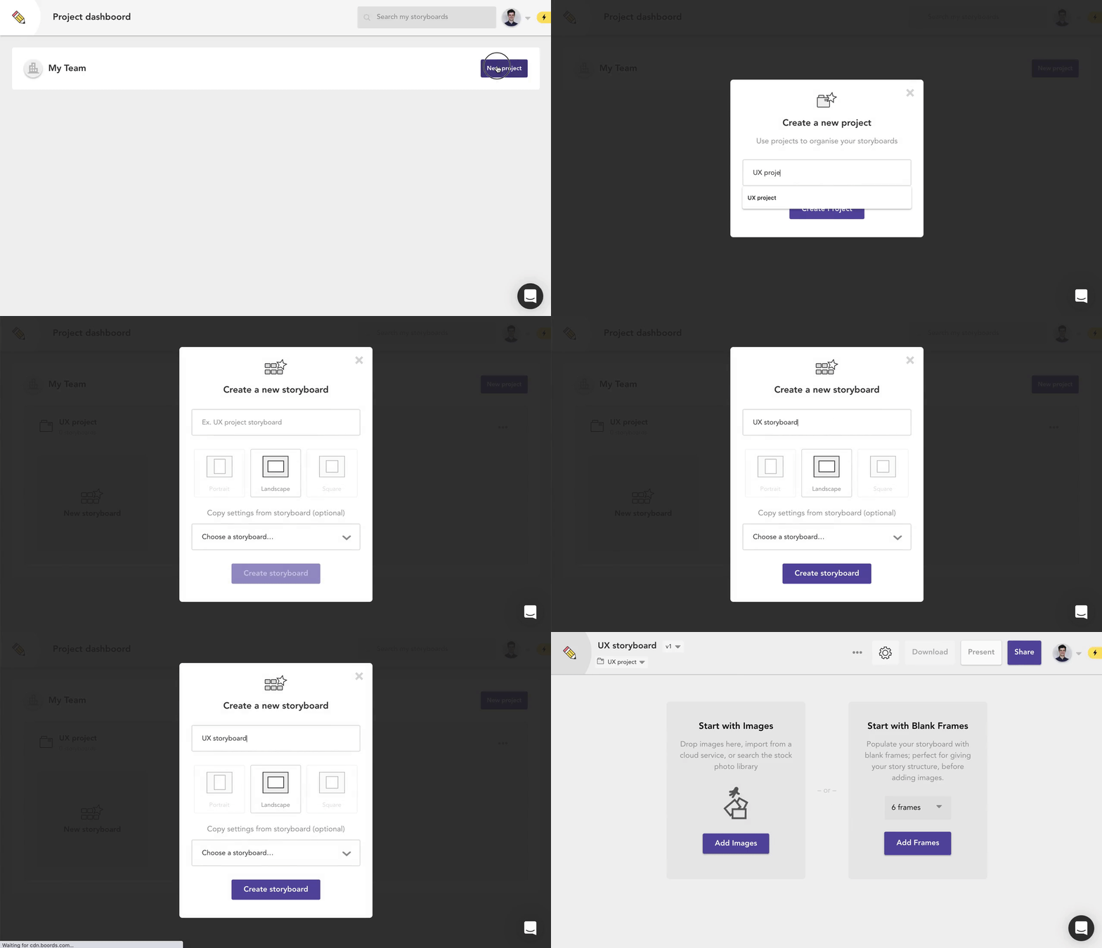
- Go to your Boords dashboard, click
New projectand name it after your UX design - You'll be prompted to create a new storyboard – you can name that after your UX design, too
- Click
Create storyboard
2. Customize your fields
You can use custom fields to add extra information and keep all your whipsmart ideation in one place. We recommend adding a Notes field and using a nifty custom icon.
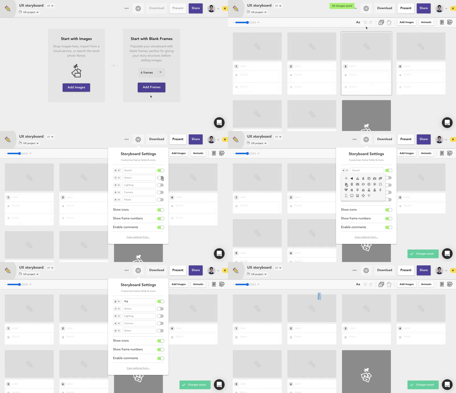
- Click the settings cog to open the storyboard settings menu
- Use the toggle to turn off the default
SoundandActionfields - Add
Notesand any other new fields that'll be useful for your planning
Pro-tip: Skip the setup and start with a ready-made UX storyboard template.
One tool for storyboards, animatics, and client sign-off. No missed feedback, no expensive reshoots.

3. Add a frame for each moment
- Break up the user journey into individual moments, with a frame for each
- Each moment should provide information about the situation, like a character's decision and the outcome – whether it's a benefit or a problem
- Label each frame so you can understand it at a glance
4. Add illustrations
Add an illustration in each frame to help tell the story. Emphasize each moment, and think of how your character feels about it. Visuals are a great way to bring a story to life, so use them wherever possible.
Don't worry if your drawing skills aren't too hot. There are oodles of stock images and handy illustrations in Boords' image editor.
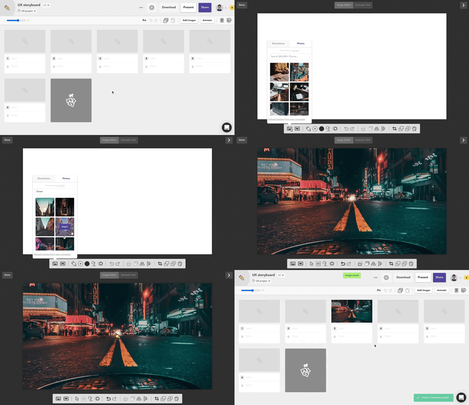
- Click
Edit image - Add a stock image, upload your own image, or use the drawing tool to sketch
- Use thought bubbles to show what a character's thinking
5. Pack emotion into the story
It's important to show the character's emotional state during each moment. You might want to add emoticons to give a clearer picture of what your character's feeling. You can use the drawing tool to create a simple human face.
6. Add notes
Leave more information in the Notes field of each frame to give more context. You can also show a character’s thinking with thought bubbles.
7. Rearrange the frames
Now that you've got the entire story laid out, take a step back and check that everything flows correctly. Drag and drop frames if you need to tweak the order.
8. Get feedback
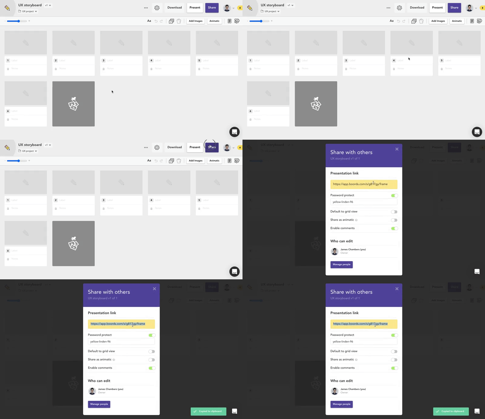
After you've drawn the storyboard, show it to other team members to make sure it’s clear to them.
- Click
Sharein the top right of the screen - Copy the presentation link
- Send the link to your team for feedback
- Optional: click
Manage peopleto give team members editing access
Here's to your next step in UX mastery. We bow down!
Take your user experience design to the next level with Boords
Say goodbye to fiddly storyboard templates. Boords is the simple, powerful way to storyboard for UX design.
Try Boords for free. And think of us when your app's sitting pretty at the top of the App Store charts.

More from the blog
The sign-off layer for video preproduction
One tool for storyboards, animatics, and client sign-off.
No missed feedback, no expensive reshoots.


