
How to Use Color Theory in Film
- Color theory in storytelling

- Picking your color palette
- The psychology of color
- Examples of how to use color in film
- Types of color schemes
- Other color schemes
When cinematographers pick a color palette for their movie or animation, it's about more than aesthetics. In fact, they're probably using color theory to stir up your emotions as you watch the images onscreen.
Back in olden tymes, filmmakers didn't have to worry about their use of color—everything was black and white. But when color films took over (starting with The Wizard of Oz in 1938), every director's technicolor dreams suddenly became a reality. (And Wes Anderson rejoiced.)
In modern-day filmmaking, the choice of color can have a huge effect on your reaction to what you're watching. The color red, for example, tends to raise people's blood pressure—while a blue color can have a calming effect.
Hollywood pros often employ color theory in their choice of color palette or color schemes, using a color wheel to get the effect they're aiming for. Which leaves you, the viewer, like putty in their hands. Genius!
Storyboard software for video agencies & brand teams
One workspace for storyboards, animatics, comments, and approvals. Spend time on the creative, not the back-and-forth.

Color theory in storytelling
Picking the right color palette for your project can be a big help in telling your story. Colors can:
- Make people feel a certain emotion
- Draw people's attention to specific details
- Set the tone of your film or animation
- Represent character traits
- Show a change or development in your story
The video below from Criswell gives a great introduction to color in storytelling.
Picking your color palette
When it comes to choosing a colour palette for your project, it pays to give it some thought. One way to get started is to create a mood board. It's an easy way to collect some images together that represent the feeling of your movie.
Then, you can bring your movie colour palette ideas to life with some storyboard software—like Boords, for example. Throw in some screenshots and videos from your mood board to start setting the tone of each shot or scene.
Get your FREE Filmmaking Storyboard Template Bundle
Plan your film with 10 professionally designed storyboard templates as ready-to-use PDFs.
The psychology of color
Now for a small science lesson. Every color has three main components: hue, saturation, and value.
- Hue is the color itself
- Saturation is how intense the color is
- Value is how light or dark the color is
When you think about it through the lens (pardon the pun) of cinematography, your choice of one specific color—its hue, saturation, and value—can have a huge effect. Lilly Mtz-Seara is an expert on the psychology of color. In this short film, she gives a good introduction to how it works.
Examples of how to use color in film
We've rustled up a few film color palette examples from Hollywood blockbusters so you can see how different colors work on the screen.
Red
Represents: anger, passion, rage, desire, excitement, energy, speed, strength, power, heat, love, aggression, danger, fire, blood, war, violence.
The Incredibles
Ex Machina
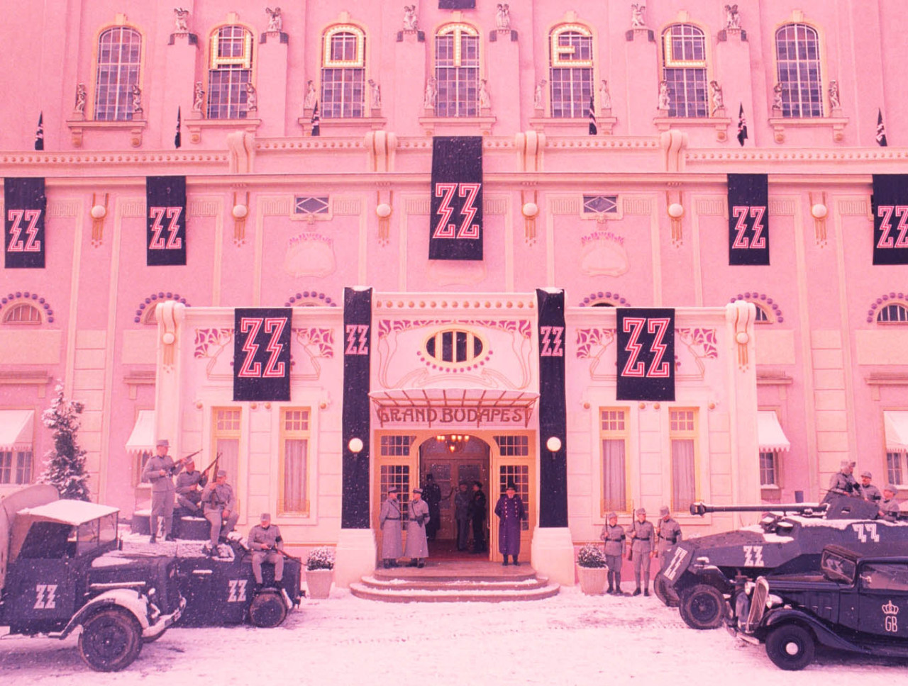
Pink
Represents: love, innocence, healthy, happy, content, romantic, charming, playfulness, soft, delicate, feminine.
Frozen
The Grand Budapest Hotel
Yellow
Represents: wisdom, knowledge, relaxation, joy, happiness, optimism, idealism, imagination, hope, sunshine, summer, dishonesty, cowardice, betrayal, jealousy, covetousness, deceit, illness, hazard.
Minions
Waltz With Bashir
Orange
Represents: humor, energy, balance, warmth, enthusiasm, vibrant, expansive, flamboyant.
Fantastic Mr. Fox
Traffic
Green
Represents: healing, soothing, perseverance, tenacity, self-awareness, proud, unchanging nature, environment, healthy, good luck, renewal, youth, vigour, spring, generosity, fertility, jealousy, inexperience, envy.
Shrek
The Matrix
Blue
Represents: faith, spirituality, contentment, loyalty, fulfillment peace, tranquility, calm, stability, harmony, unity, trust, truth, confidence, conservatism, security, cleanliness, order, sky, water, cold, technology, depression, calming.
Corpse Bride
The Dark Knight
Purple / violet
Represents: erotic, royalty, nobility, spirituality, ceremony, mysterious, transformation, wisdom, enlightenment, cruelty, arrogance, mourning, power, sensitive, intimacy.
Tangled
Brown
Represents: materialistic, sensation, earth, home, outdoors, reliability, comfort, endurance, stability, simplicity.
Chicken Run
Stepmom
Black
Represents: no, power, sexuality, sophistication, formality, elegance, wealth, mystery, fear, anonymity, unhappiness, depth, style, evil, sadness, remorse, anger.
Persepolis
White
Represents: yes, protection, love, reverence, purity, simplicity, cleanliness, peace, humility, precision, innocence, youth, birth, winter, snow, good, sterility, marriage (Western cultures), death (Eastern cultures), cold, clinical, sterile.
The Huntsman: Winter's War
Silver
Represents: riches, glamorous, distinguished, earthy, natural, sleek, elegant, high-tech.
2001: A Space Odyssey
Robocop
Gold
Represents: precious, riches, extravagance. warm, wealth, prosperity, grandeur.
The Lion King
The King
Types of color schemes
Directors use different techniques to make sure they've got a balanced movie color palette. In this section, we'll introduce you to four different color schemes: analogous, complementary, monochromatic, and triadic.
As we've learned above, single colors can represent certain feelings or emotions. But a more developed film color palette helps you get across all of the themes in your story. Each of the color palettes below refers to the relationships between colors on a color wheel.
- Analogous color schemes are kindred, like-minded, and sympathetic.
- Complementary color schemes are tense, embattled, and reflect duelling tension.
- Monochromatic color schemes are totally harmonious, undivided, and lulling.
- Triadic color schemes are vibrant, but balanced and evenly matched.
Analogous color schemes
Analogous colors are groups of three colors that sit next to each other on the color wheel. They're made up of one dominant color (usually a primary or secondary color), then a supporting color (a secondary or tertiary color), and a third color that's either a mix of the two first colors, or an accent color that pops.
When it's all combined, you get an analogous color scheme with a rich, monochromatic look. It's best used with either warm or cool colors, creating a look that has a defined temperature as well as tasty color harmony.
Complementary color schemes
Complementary colors – or 'opposite colors' – are pairs of colors that cancel each other out when they're combined or mixed. Orange and blue are complementary colors that you see used in the color palettes of lots of blockbuster films.
Directors use complementary colors to represent conflict, both internal or external. Whichever colors you pick, complementary colors combine warm and cool colors – making for a high-contrast, lively tension in the film.
Monochromatic color schemes
A monochromatic color scheme is when you extend a single base 'hue' with shades, tones, and tints. You get tints by adding whites, and shades by adding black. You can use all these contrasting tones to create a harmonious feeling of color #synergy.
Just think about Wes Anderson's flagrant use of pink in The Grand Budapest Hotel. Or the sickly green color scheme that's all over The Matrix. Monochrome, baby!
Triadic color schemes
A triadic color scheme is when you use three colors that are evenly spaced around the complementary color wheel. You pick one color in the triadic color scheme to be the dominant one, then use the other two as complementary colors.
Triadic color schemes aren't as common as the others, but you often see them in superhero films like Superman. When the scheme's used well, it gives a comic book feel.
Other color schemes
Discordant color schemes
Some directors choose to walk on the wild side, skipping more conventional color schemes for a bit of discordance instead. It's not just for giggles, though. Picking a high-contrast color can help a character, detail, or moment stick out in the film.
For example:
- The color blue in Amelie
- The color red in The Sixth Sense
- The girl's dress in Schindler's List
- Splashes of primary colors in Sin City
Associative color schemes
Associative colors in film are when a director uses a recurring color or scheme to represent a particular theme or character. This combines a memorable visual cue with emotional storytelling, for a more powerful watch.
You can see it in The Dark Knight, where Christopher Nolan gives associative color palettes to two main characters: Batman (dark blacks, greys) and the Joker (muted purple and green). This color clash represents the tension between the two characters' personalities.
The Godfather also uses associative colors. In the film, orange is associated with death – so when we see the color onscreen, we know violence is imminent.

Sharper preproduction, less back-and-forth
Workflow tips and Boords product updates for video and brand teams, twice a week.
Related links
More from the blog

Put your color theory to the test with Boords. Trusted by 150,000+ creatives.
Create and share storyboards online. Keep your team on the same page.


Storyboard Activity
Sarah changed the status of Explainer Video v3 to Approved
8 JulSarah viewed Explainer Video v3
8 JulTom shared Explainer Video v3 with sarah@beacon.co, dev@beacon.co
7 JulTom changed the status of Explainer Video v3 to Review Needed
7 JulTom created Explainer Video v3, a new version of Explainer Video v2
7 JulAmara marked a comment on Explainer Video v2 as complete
7 JulDev commented on Explainer Video v2 - Frame 4
6 JulStoryboard Activity
Sarah changed the status of Explainer Video v3 to Approved
8 JulSarah viewed Explainer Video v3
8 JulTom shared Explainer Video v3 with sarah@beacon.co, dev@beacon.co
7 JulTom changed the status of Explainer Video v3 to Review Needed
7 JulTom created Explainer Video v3, a new version of Explainer Video v2
7 JulAmara marked a comment on Explainer Video v2 as complete
7 JulDev commented on Explainer Video v2 - Frame 4
6 Jul